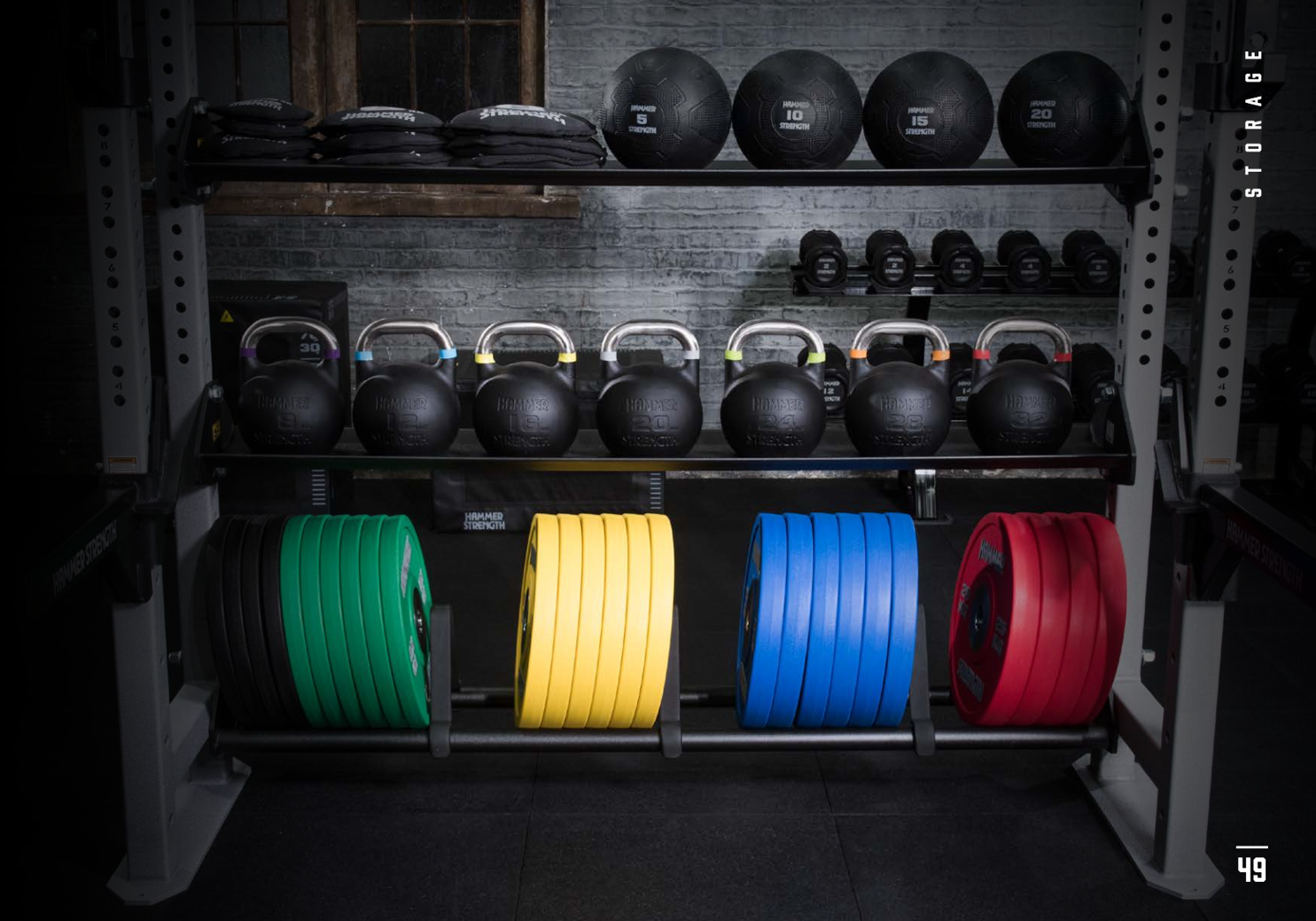
Hammer Strength Accessories
The Challenge:
Hundreds of SKUs mire customers in web navigation, search functionality, UI/UX, and most importantly, failed conversions. Competitors also failed to categorize and present their accessories succinctly. This left an opportunity to lean into Hammer Strength’s credibility in the strength industry and literally redefine the categories of strength accessories.
The Solution:
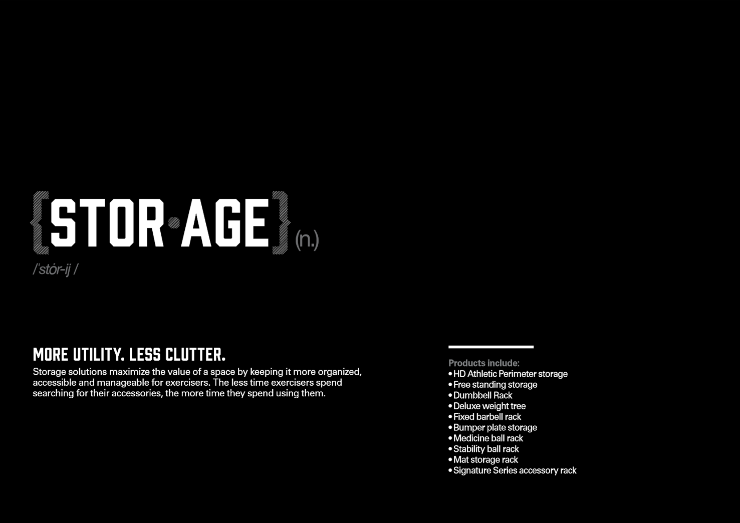
Our goal was to be the defining example of how an industry leader presents its strength accessories. We created a primer and product catalog that could be easily duplicated on the website navigation menu for consistency and clarity. It uses the Hammer Strength tone of voice and ethos to define each category with written and visual accents, e.g., pronunciations and syllabic dividers like you’d find from Merriam-Webster.
Results: Conversion rates increased due to easier web navigation and clarity, customers relayed positive feedback about their user experience, and the VP International of Life Fitness called it the best sales support piece he’s seen produced at the company.
Credit
Writer: Chris Olson
Designer: Jackie Ortiz